


Sprint Burndown charts are evolving and active artifacts on a Scrum Team. When a Sprint Backlog item – a single task or deliverable defined and estimated by a Team member – moves from in progress to complete, it’s estimate is removed from the total estimated work remaining in the Sprint. There is not a lot of value estimating how many hours are remaining – the work is either done or not. However, as a Team further refines their understanding of what needs to be done, creating new Sprint Backlog and estimates are added to the total estimated work remaining. It is important that the Sprint Backlog and Sprint Burndown chart stay in sync since the graph gives visibility on the Team’s understanding of the work.
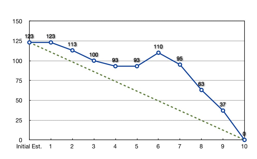
There are four common patterns in most Sprint Burndown charts. The sample chart above, based on real Sprint data from a 2010 Scrum Team, displays all of these patterns.
- The Sprint Burndown goes flat, as seen on Days #4 and #5.
- The projected trend (or slope) has the Team completing the Sprint after the timebox expires, as shown between Days #6 and #7.
- New work is added late in the Sprint, as indicated on Day #6.
- A large delta between the actual progress of the Team and the predicted progress of the Team (as if they had burned down an equal amount of work each day), as seen between Days #5 to #9.
In all these cases, these patterns provide an opportunity for the Team to discuss what is really going on and provide an explanation. If the Team is confident they can still fulfill the Sprint Goal regardless of how the data is displayed in the Sprint Burndown chart, the Product Owner and the ScrumMaster should always respect the judgement of the Team. Recall, the Team commits to delivering the Sprint Goal at the Sprint Review, not to deliver the Sprint Backlog items.