


Choose Your Agile Metrics Wisely
Whatever your feelings on metrics, organizations will expect them for your team. Take care, though. You don’t want to measure one facet to the detriment of other information. And you don’t want to measure too many things and scatter your team’s focus.
So which metrics matter and how do you choose them? There are dozens of options out there, developed by brilliant Agile minds. Unfortunately, there are many more metrics that are useless. Eric Ries, author of Lean Startup, calls them “vanity metrics” because they look good — and make you feel good — but offer little in the way of actionable value.
As a foundational step, the organization’s success levers must be determined. That is, step up a level and first agree on what measures are being used to track the success of the organization or a project. In my years of working with organizations I’ve found there are six “levers” that organizations care most about.
- Value: Are we meeting the customer’s needs?
- Predictability: The ability to plan and deliver
- Productivity: Getting more done in the same time or with the same resources
- Quality: A product free of defects and issues
- Stability: The organization can maintain this pace indefinitely
- Growth: Is the organization growing and learning?
If we can agree that these are key levers for tracking organization success, what metrics should be used to reflect this at the Agile team level?
With the goal of “helping the team to reflect and improve” and the caveat “your mileage may vary,” here are my four go-to metrics for an Agile team to gauge their ability to impact the organizational success levers.
4 Metrics to Improve Agile Team Performance
There is no silver bullet for measuring Agile performance. If you only count one metric, it is easy to get tunnel vision. Be it the team focusing on just making the metric better (often through gaming the system) or management using the metric to drive all decisions, you can end up with a product or organization that looks good but is really driving off a cliff.
More is not better. If you are using ten metrics it is more likely that different parts of the organization will focus on different metrics, driving a wedge into the efforts to align the organization. Humans are best able handle three to five concepts at a time. Based on experience, I have found there are three lagging and one leading measure that support one another:
- Cycle Time (Productivity)
- Escaped Defect Rate (Quality)
- Planned-to-Done Ratio (Predictability)
- Happiness Metric (Stability)
The rationale and application of each metric is described below.
Cycle Time (Productivity)
Cycle time is your direct connection to throughput and is a way to measure team productivity. The shorter the cycle time, the more things are getting done in a given timebox. This concept is demonstrated in this short video on Batch Flow. As you can see, the bottom flow has a cycle time of twenty-nine seconds to deliver ten units of value. The top flow has a cycle time of one minute to deliver the same amount of value. For every minute, the bottom flow can deliver twice the value as the top flow.
Cycle time can be most simply measured from when work starts to when the work is done. In software terms, I tend to think of this as “hands on keyboard” time. Measuring cycle time is best done automatically via your Agile lifecycle tool of choice, though measuring with a physical task board will also give you useful data.
Escaped Defect Rate (Quality)
This measure tracks overall quality and is the connection between customer satisfaction and the team. The lower the defect rate, the more satisfied the customer is likely to be with the product. With a high escaped defect rate, even the most awesome product is going to have a lot of unsatisfied customers.
Escaped defects are measured by the number of problems (bugs, defects, etc.) found in the product once it has been delivered to the user. Keep in mind, though, that until a “story” is done, it is still in process, so any issue identified is not a defect, it’s just another task to complete before the work can be considered “Done.”
Planned-to-Done Ratio (Predictability)
This metric is a way to measure predictability. If a team commits to thirty product backlog items and only delivers nine, there is about a 30 percent chance of any one item being delivered in the Sprint. If, on the other hand, the team commits to ten PBI and delivers nine, there is roughly a 90 percent chance of any one PBI being completed. This predictability helps both the Development Team and the Product Owner.
Measuring Planned-to-Done ratio is a simple exercise of documenting how much work the team commits to doing at the start of the Sprint versus how much they have completed at the end of the Sprint. Be careful with teams that have challenges with adding work in the middle of the Sprint. If this is common, you will want to pay careful attention to what “Done” work was part of the plan vs. added later. If a team planned to do ten items, added five items and only got the five added items done, then their Planned-to-Done is 0%, not 50%. They did not complete any of the planned work.
Happiness Metric (Stability)
This is the team “health” metric. It creates awareness that puts the other three metrics into better context. If all the other metrics are perfect and happiness is low, then the team is probably getting burned out, and fast. The Happiness Metric is also the only leading indicator in the bunch.
Build this into your Sprint retrospectives. Open every retrospective with the team writing down their happiness scores on whatever scale you choose. Track these numbers from sprint to sprint to see the trends. One ScrumMaster I worked with created a simple Google Survey and sent this out before the Retrospective. This allowed him to add in the supporting questions of the full Crisp Happiness Metric, as detailed in this Scrum Inc. blog post I’ve begun recommending this approach with all my clients.
How These Four Metrics Work Together
Cycle Time and Escaped Defect Rate are highly quantifiable and well understood across industries. Smaller numbers mean you are delivering a higher quality product, faster. Planned-to-Done has an immediate and real impact, and provides an “early win.” Over time, it becomes useful mapping predictability, which helps in forecasting. The Happiness Metric is the “human factor,” which lets us gauge the overall team health.
The first three measures form a self-supporting triangle that prevents gaming the system. If you crash your Cycle Time, then defects will almost certainly go up. A high Planned-to-Done ratio can be great, unless cycle time is through the roof, showing the team is getting very little done per sprint. Finally, by layering the Happiness Metric over the rest, you can see the human side of the equation. A low happiness score is nearly always a sign of underlying problems and can be a leading indicator of something else.
What About Value and Growth
I don’t have a standard team metric for the organizational lever of Value. This is far more subjective and personal to an organization. This can be a Net Promoter score, revenue, average active users, etc. Just remember that story points or even items completed does not automatically equate to value. Items completed are output. Outcome is the goal and not always equal to your output. Growth is its own topic and typically exists at the organization level, answering questions such as “is our change effort working?”
What About Velocity
Velocity is a useful measure for Sprint Planning — but it does not measure success. It offers a rough gauge of how much work to plan in the next Sprint based on past performance. Velocity can be horribly misused if shared up the management chain. There are better ways to predict when a team will be done or how effective it is.
When measuring Velocity, I measure both the Story Point and Item Count Velocity. By doing this, I find the team has built-in checks and balances to their workload.
For example, let’s say the team has a three-Sprint average of 50 Story Points and 10 Items. If their next Sprint is 48 Points and 9 Stories, then they are probably going to finish all the work. If they exceed one of the numbers—say, doing 48 Points but 20 Stories (a bunch of small ones)—then the Sprint might be at risk, as that’s a lot of context switching. And if they exceed both numbers—say, committing to 70 Points and fifteen Items—then this is a clear warning flag, and a good coach might want to touch base with the team to make sure they are confident that they can do better than their rolling average.
Examples of the Four Metrics in Action
These charts are based on real data and are a snapshot taken about eighteen months into an Agile transformation. I tend to stick with a six-month rolling window because if you go much beyond that, things have changed so much as to be irrelevant to what the team is doing or working on now.
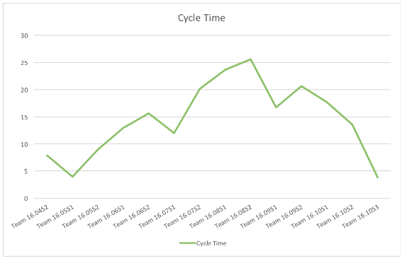
- Cycle Time
The spike represents the team moving to a new project and the ramp-up time as they got used to the work on the new project while going through a series of organizational changes.
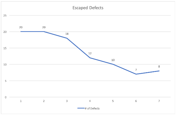
- Escaped Defect Rate
This graph shows a fairly typical curve for teams that have moved to cross-functional roles and automated testing. With everyone in the team jointly responsible for the items in the Sprint, including product quality, and a greater focus on test automation, we see a dramatic drop in defects found in the product after release.
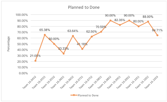
- Planned-to-Done Ratio
This team lost its ScrumMaster, which impacted its overall performance, as reflected in the first Sprint’s data. In the second sprint, an experienced ScrumMaster came in to help. The early dips represent the team getting used to a new set of norms, and the later dips were a result of changes in the program that reduced the clarity of the team’s backlog.
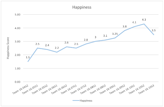
- Happiness Metric
The data shows how the support of the experienced ScrumMaster improved the team’s overall health. The graph also reflects that the churn in the product and organization impacted the team’s happiness later on.
Based on these graphs, I engaged with the team and listened to what had been going on in the last couple of sprints. The dip in the Planned-to-Done ratio and Happiness Metric were enough to tell me there might be something going on. The low cycle time and escaped defects led me to suspect the problems were external to the team.
The real challenges were coming from a chaotic product strategy that had the team bouncing around among priorities. The volatility in the backlog changes led to lower quality stories. The team had sufficient experience to stop when they dug into a story they didn’t understand and shift to work they did. This lowered the Planned-to-Done ratio because not all planned work could be finished, while cycle time was low as they worked on things they understood well.
Agile Team Metrics Template
I’ve found success using these four interrelated metrics, and encourage you to try them as well. Their interrelationship prevents gaming one measure without impacting others. They provide useful data to the team for retrospective improvement, and they are meaningful to leadership and help with forecasting.